
During my bachelor quarter at NEIT, I had an assignment to rebrand a brewery’s current package design. I was assigned Copper Trail Brewing Co. in Alexandria, Minnesota. There were many challenges I faced over the course of the rebranding project from figuring out the target audience and defending my position on the rebrand. Read more to learn my rebranding process.
Who They Are Now
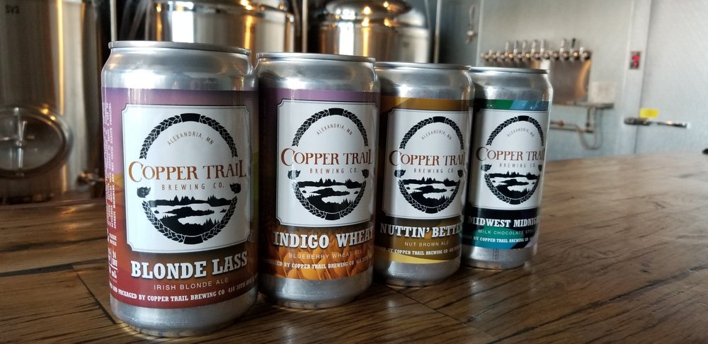
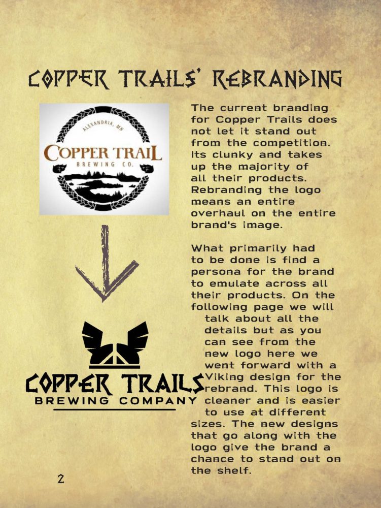
The first problem that I found was a technical one. Their current logo has too much detail in it. The only way they could properly display it is if the logo takes up the majority of the space on packages and other Copper Trail merchandise.
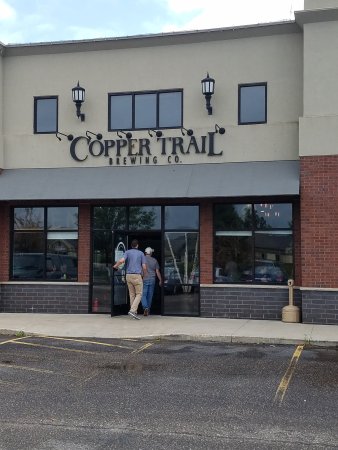
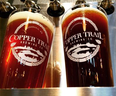
Current Brand
The second problem I found was they didn’t have a style that followed through on all their designs. Their website said they were contemporary and their beer packages were saying they were an artsy brand. So right off the bat, one of the goals would be to unify the brand.
Inspired by the Area
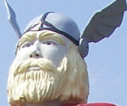
At first, I wasn’t sure what kind of theme I should go with for the assignment because the website didn’t offer me a good direction. So I decided to get inspiration from the town that the brewery resides in. When I searched the town it didn’t take me long to find my source of inspiration.
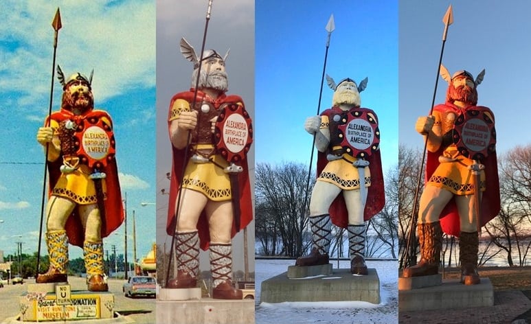
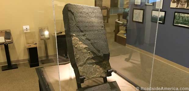
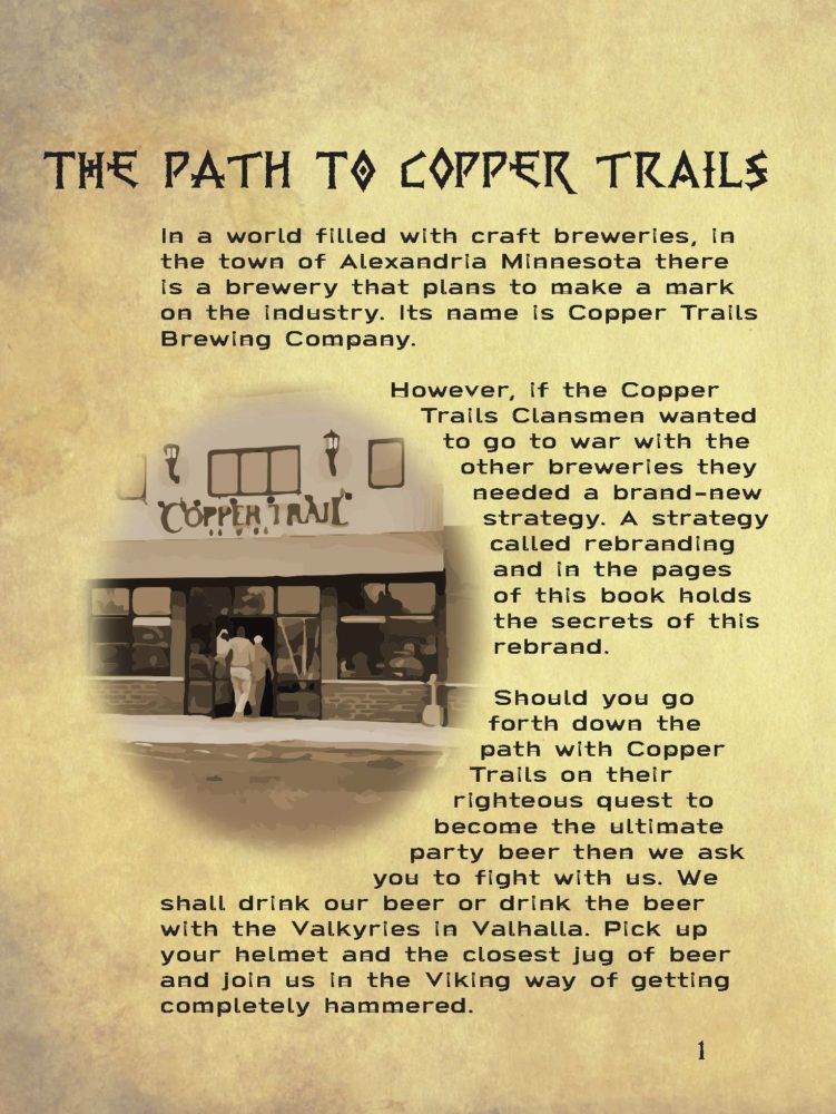
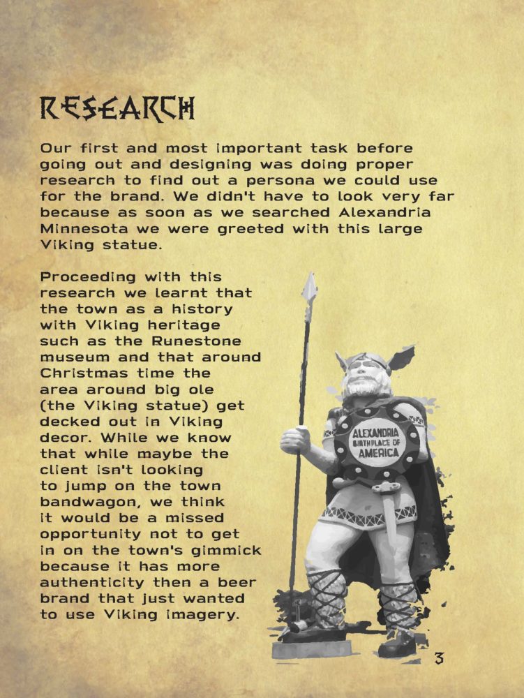
In Alexandria, there is the Big Ole Viking statue as well as a rune stone believed to be proof that the Vikings once settled around there. There are even pictures of the Christmas decor being very Viking like. Not being one to look a gift horse in the mouth that quickly became my main source of designing going forward.
Target Persona
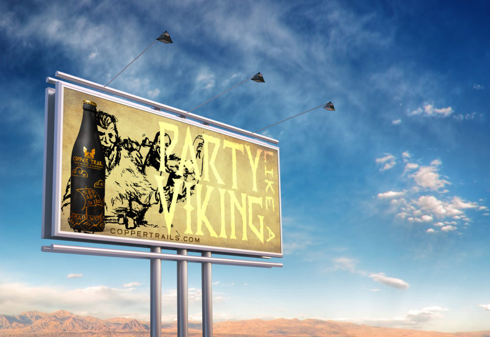
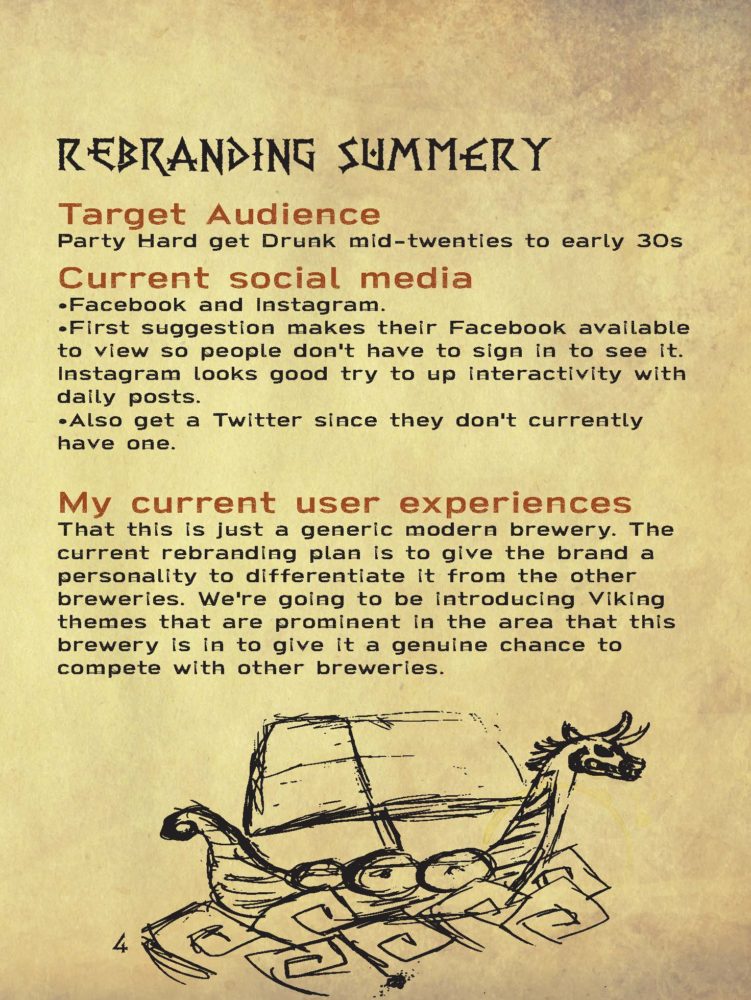
I couldn’t just think this is the theme I’m going with. At the same time, I needed to have a target audience I wanted to sell the beer to. It took some time to pin down what kind of personality and age range they would have but I was able to choose the target persona. The brands best chance would be to target the late 20s to mid-30s, frat party drinkers as the main persona. The next persona group that would be targeted would be people who are interested in Viking culture and imagery.
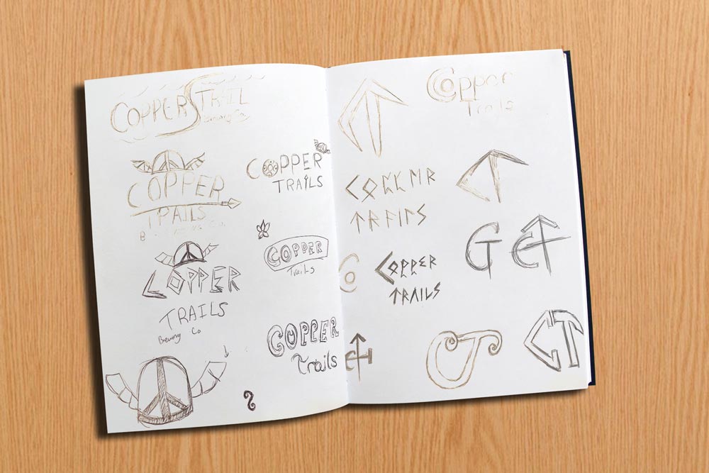
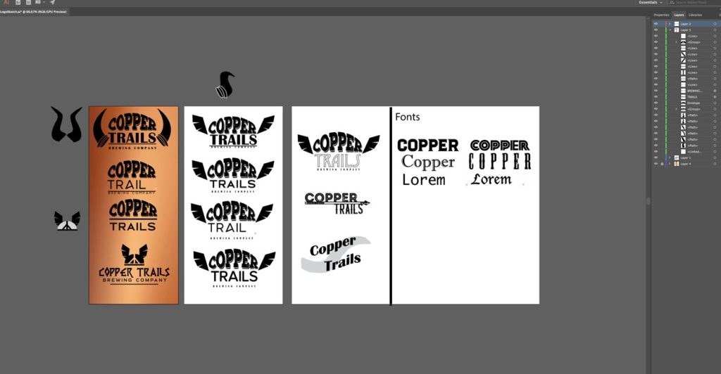
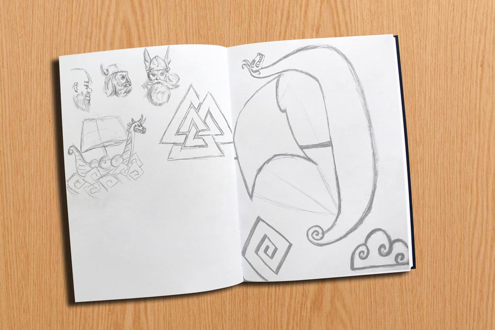
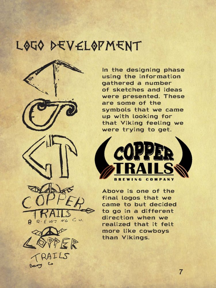
Logo Re-Design
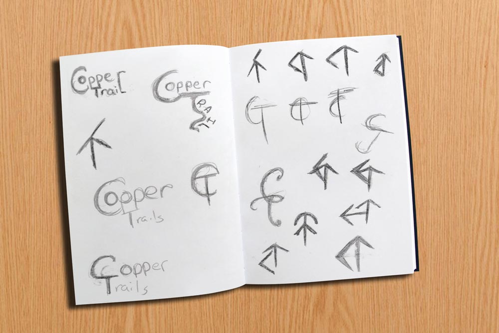
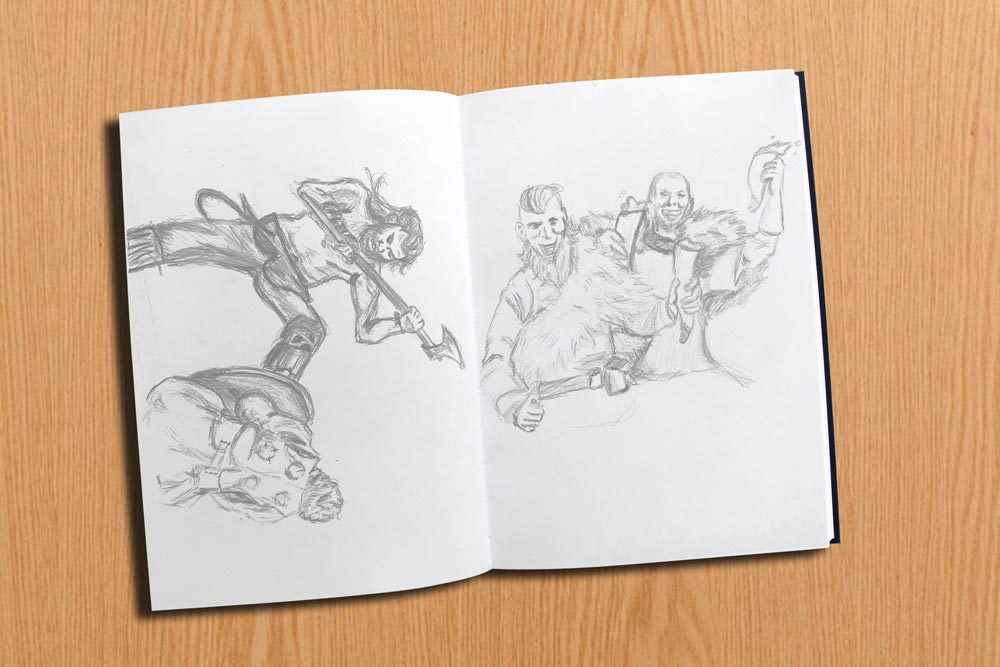
Sketches
Adobe Illustrator
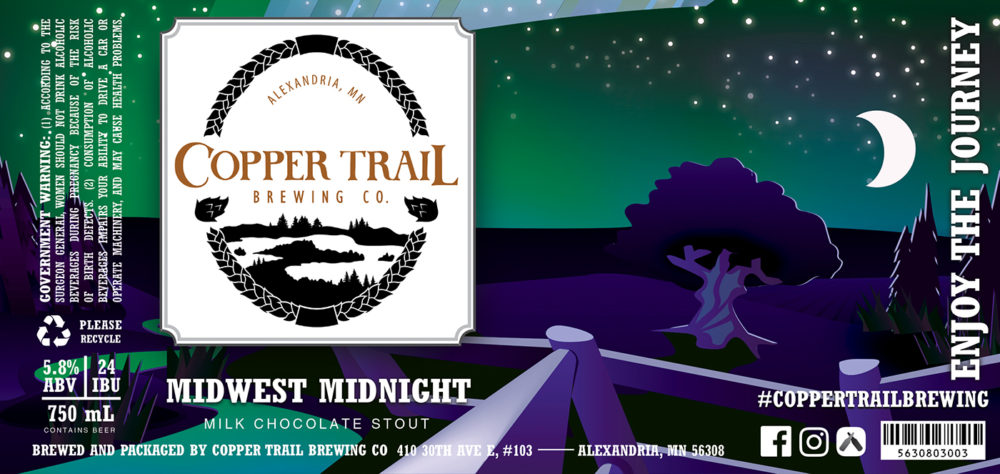
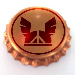
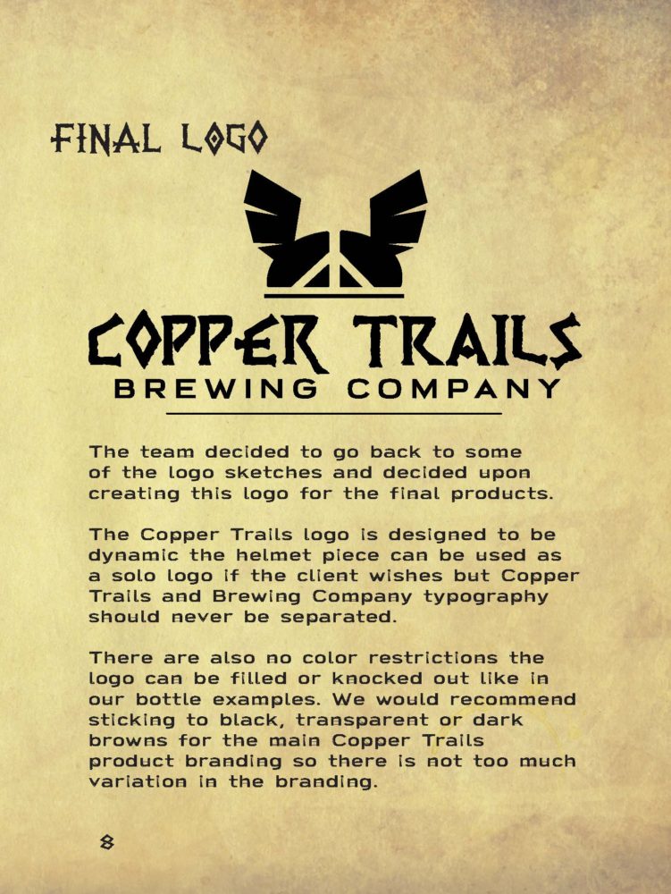
Final Logo
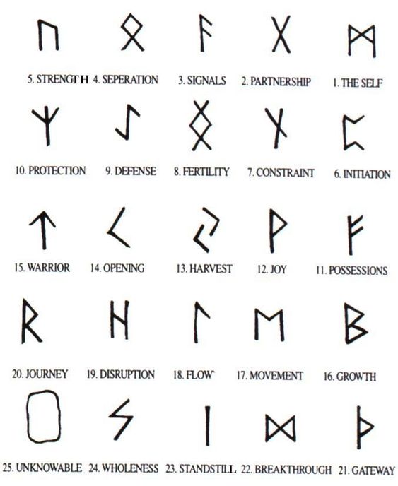
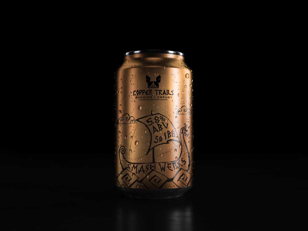
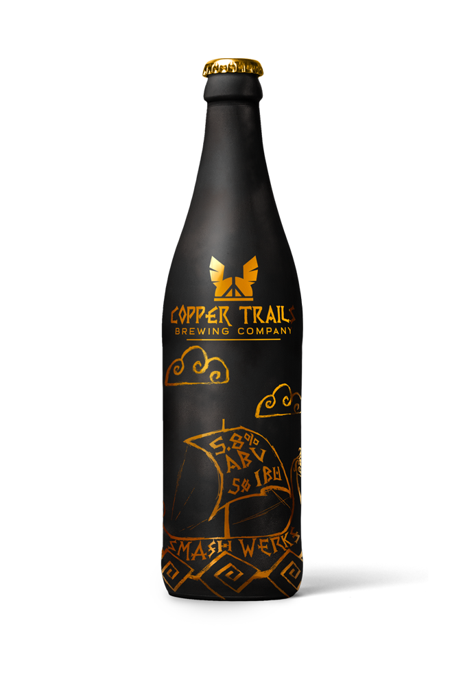
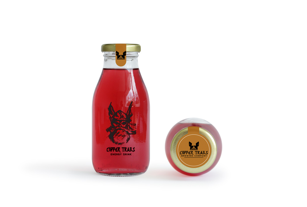
The final logo for Copper Trails was inspired from runes and the Viking helmet on Big Ole. The plan was to use a coppery color on the packaging the logo is kept in black for easy retooling.
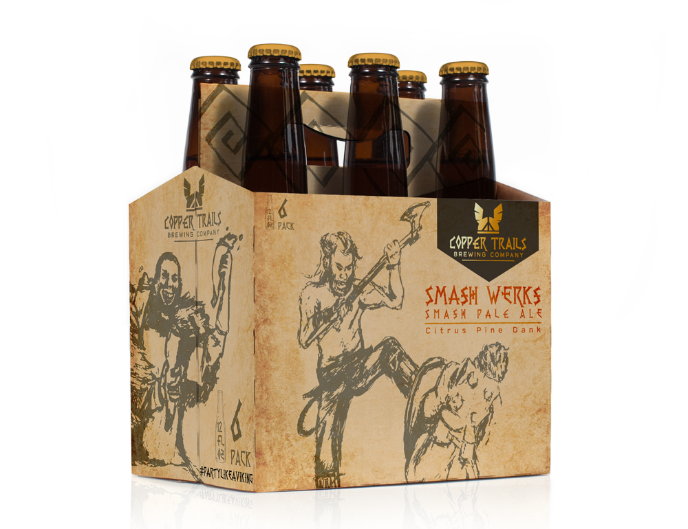
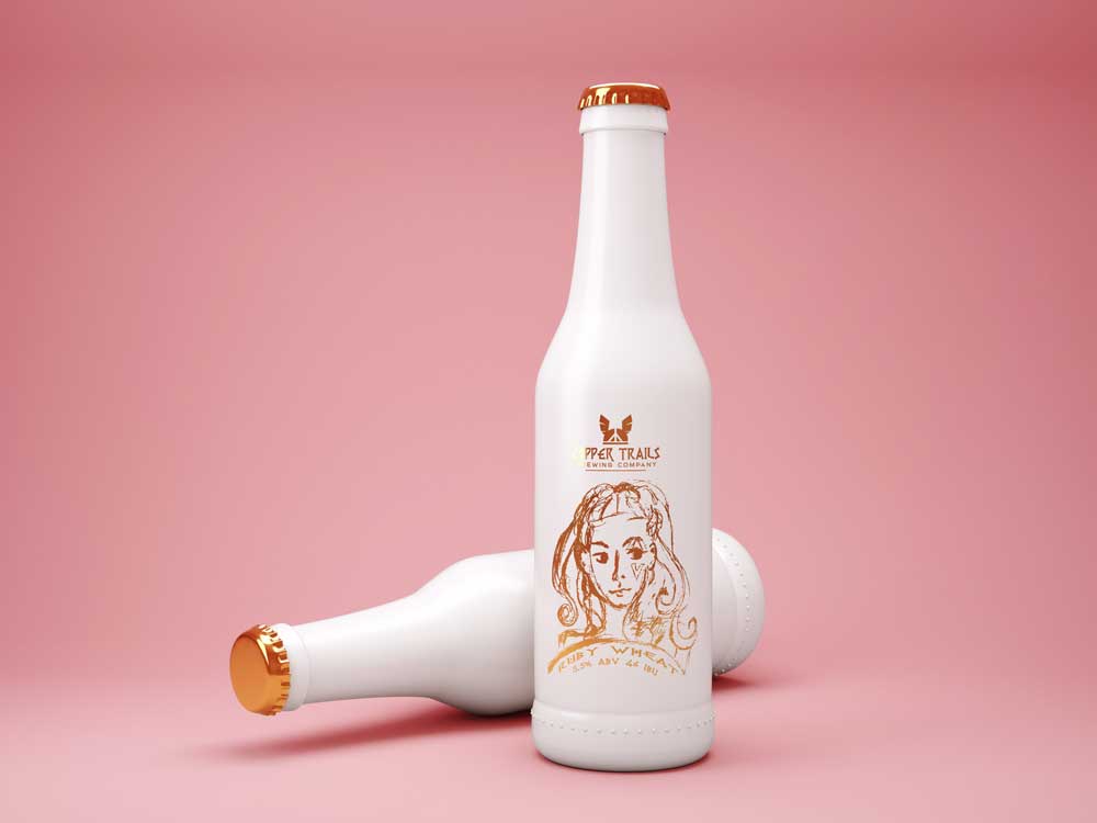
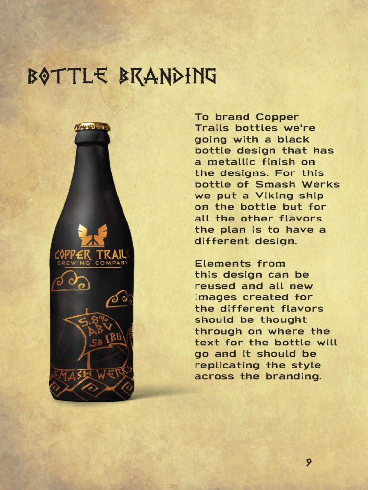
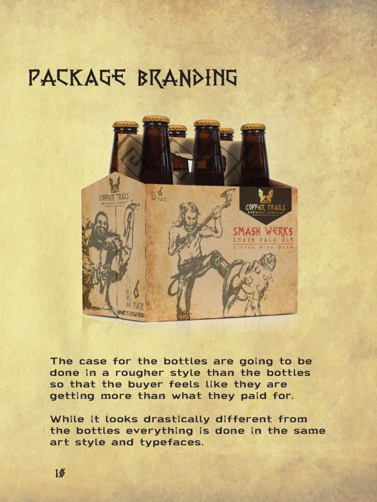
Package Re-Design
The design was idea was pretty simple. I would let the drawn assets take over the pieces as much as possible so the typography had to work inside or around the image. When I drew things like the boat I had to think ‘this area needs to be big enough to fit type inside it.
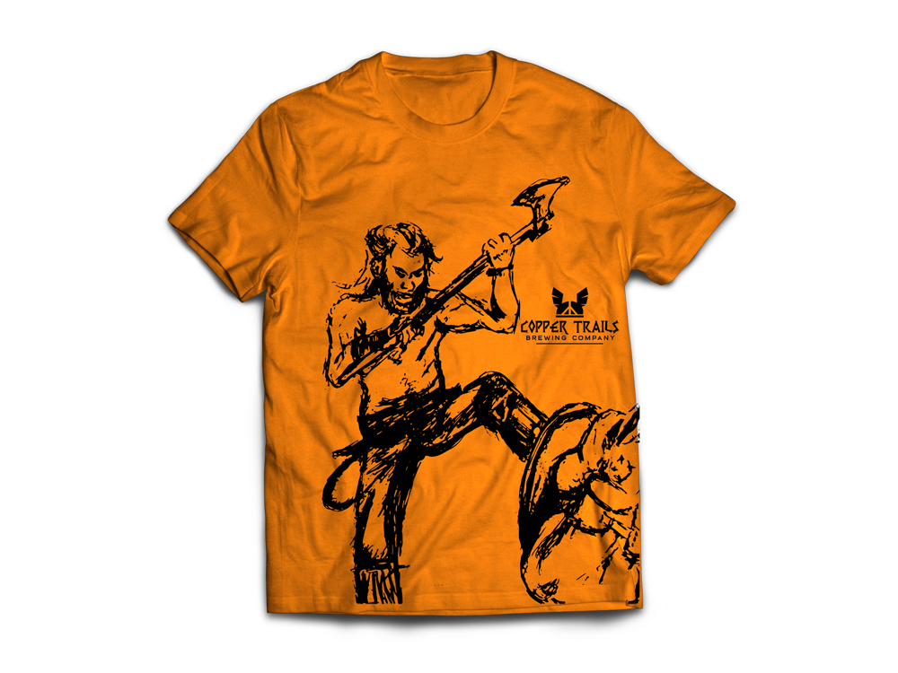
Art Assets
Photoshop Mockups
Copper Trails Style Guide Book & Poster
Story Boards
Printed Poster and Book


Copper Trails Mobile/Web Design
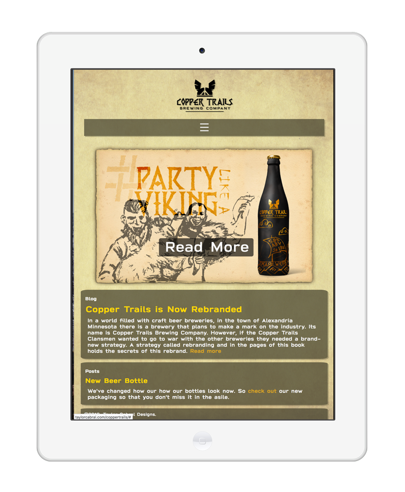
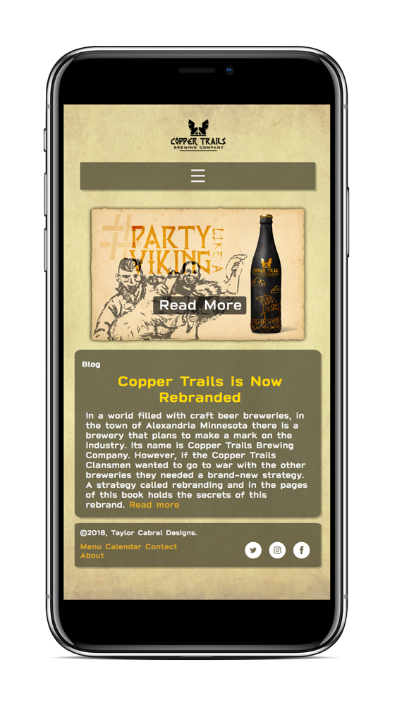
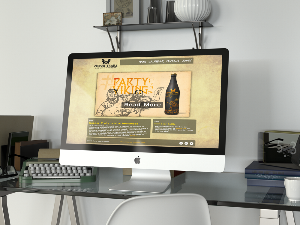
You can try out the website over here! taylorcabral.com/coppertrails
Final Thoughts
This took 10 weeks to complete and I made so many things for just one brand I felt really satisfied with it in the end. I would even say this is the project that made me choose the graphic illustrator path cause I was able to make something so unique to me. Thank you so much for taking a look at this daunting post feel free to contact me over on my contact page should you need any more info.