Project Summary
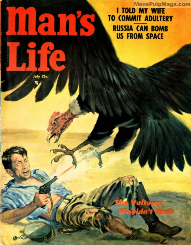
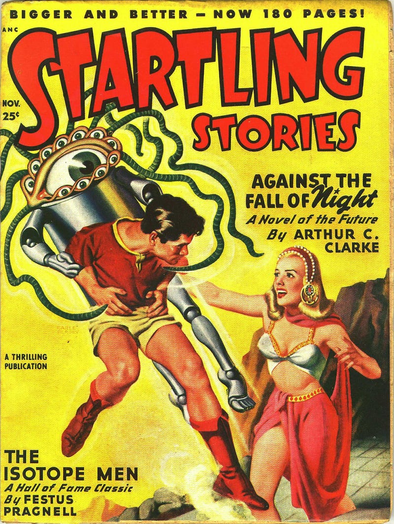
The point of the project was to take a modern movie and stylize to make it look like a pulp fiction poster. Pulp fictions were magazines that were sold from the late 1890s to the 1950s. These stories were printed on cheap materials and considered low-quality literature which is why they were so affordable to the common person.

Research
First, I took a look at the type treatments for these older pieces, how they had diagonal text, used many types and even used outlined text. The comic book quality images and the not so detailed backgrounds, in my opinion, where not as important as how the text gives the older style feel.
Finding Dory
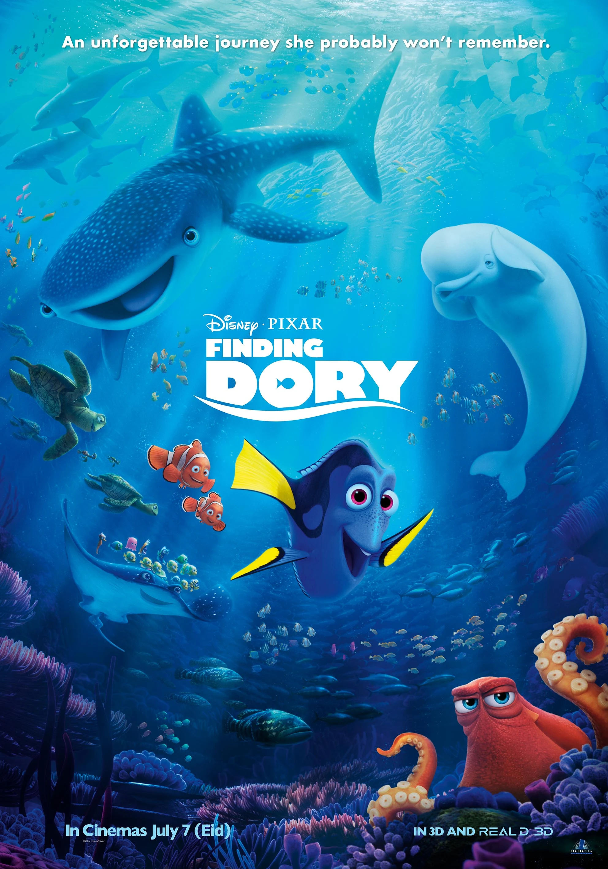
Finding Dory was the movie that came out at the time I was doing this project so that was the movie I chose. So starting off I had to find images for the three most important characters, Dory, Marlin and Nemo, and a good background image.

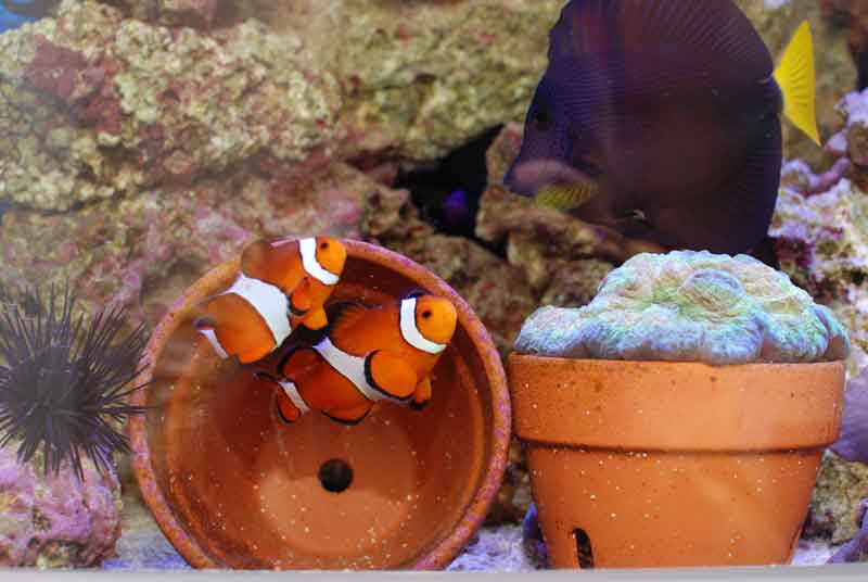
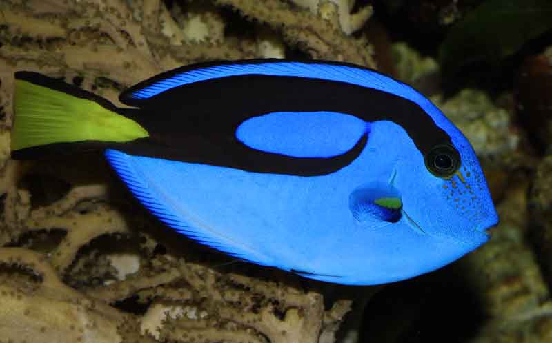
These are the three images we’ve chosen to composite. To get the retro printing feel of pulp fiction posters a pixel effect was used to pull apart the colors to make them rasterized. The fish were then masked out of their environments and put into a new environment with a couple of textures used to make them seem more like old style drawings.
Making it Vintage
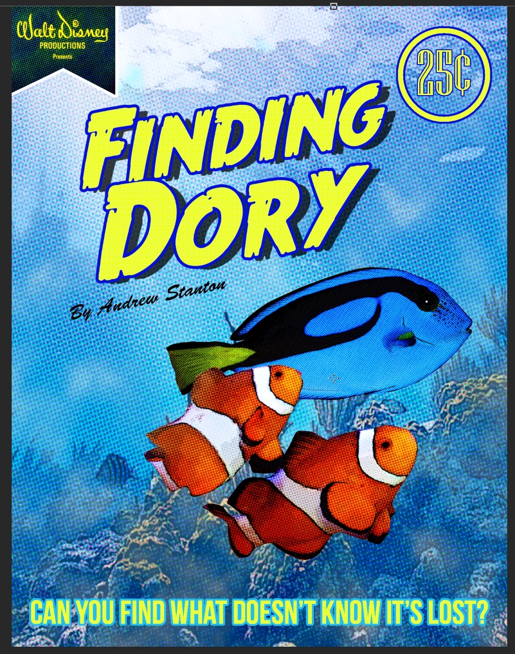
I went to work by adding in the elements that gave it its vintage feel. The theme is primarily yellow and blue is because these were the main colors in the fish that Dory is. The colors were picked directly from her. The 25 cents and the old Walt Disney logo to also add the vintage feel. In order to bring it to its final stages, I needed to make it look like it had been around for a few years. So, I added a few paper textures and it ended up looking like this.
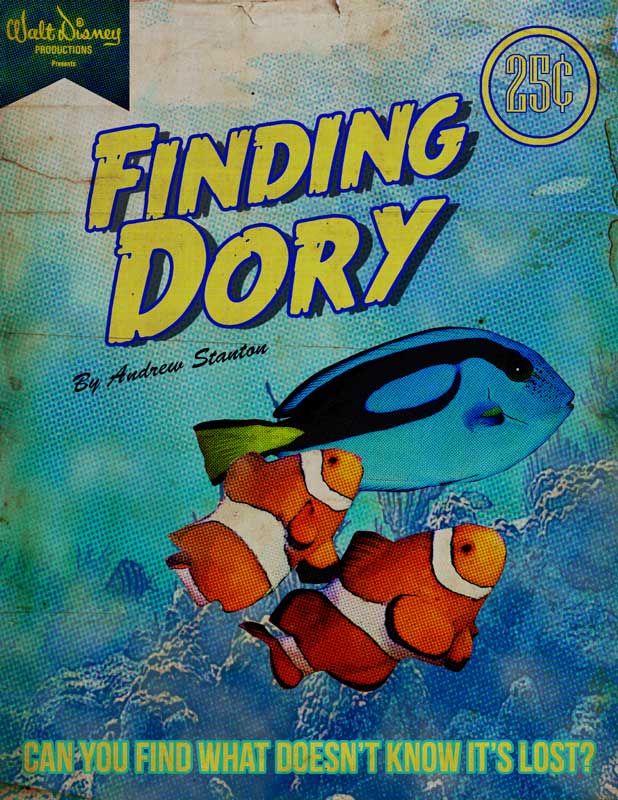
By the end of the project, I managed to piece together pictures and make them look like a Pulp Fiction Poster.
If I could do it again
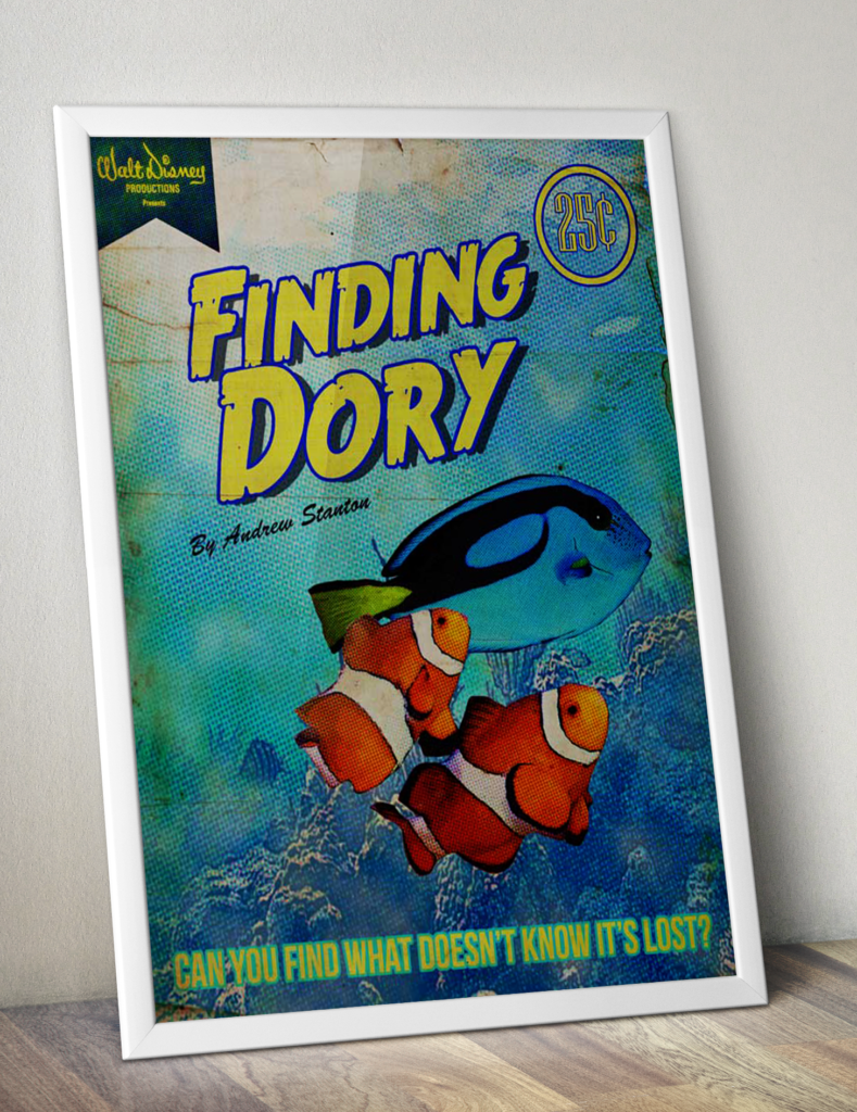
I would try to make the figures even more than more stylized look. I would probably try giving a crack at drawing them myself to make them look more authentic. Overall, this project taught me how you can break the rules of traditional graphic design when trying to replicate older styles. If you would like more information on this assignment, feel free to leave a comment or message me over here.
