Project Summary
Redesign an assigned coffee brand for an existing coffee house. I was assigned Lola Coffee Bar in Phoenix, Arizona.

Process
My research by first visiting their website. Going to their Facebook page and then reading up on the other coffee houses in the area. I came up with my target personas. Artistic likes to spend their time in the shop, and enjoy desert type drinks. Starbucks is also a competitor that I had to consider when designing for the brand.
I went straight to work with collecting inspiration for the logo and colors I wanted to use. Pink quickly became a color I intended to incorporate. It’s an eye-catching color and it helps give the feminine touch that a brand named Lola would have.

I tried something a little different this time. When creating a logo and experimented with a number of fonts in illustrator. Once I got the logo I was looking for I went to work on several sides of the product.
Design
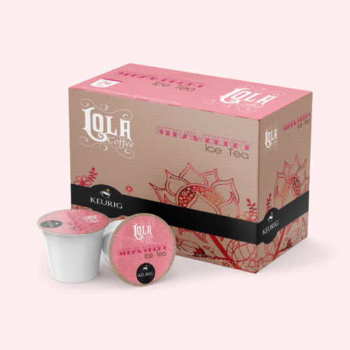
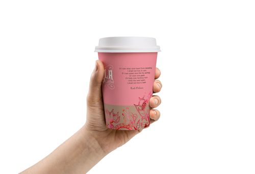
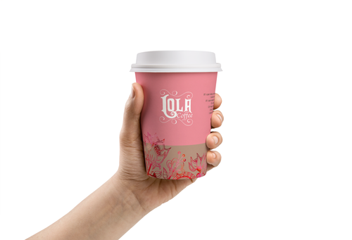
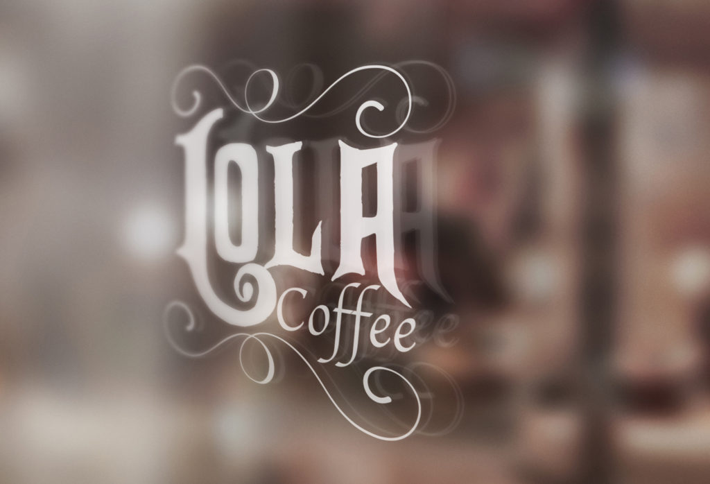
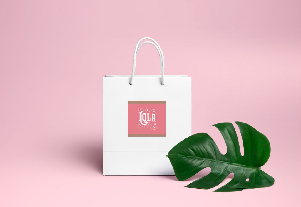
Keep everything simple and make sure to keep everything consistent. While making sure everything looks good and vibrant on their mock-ups. All the poetry that I incorporated would actually be the main component.
UI/UX
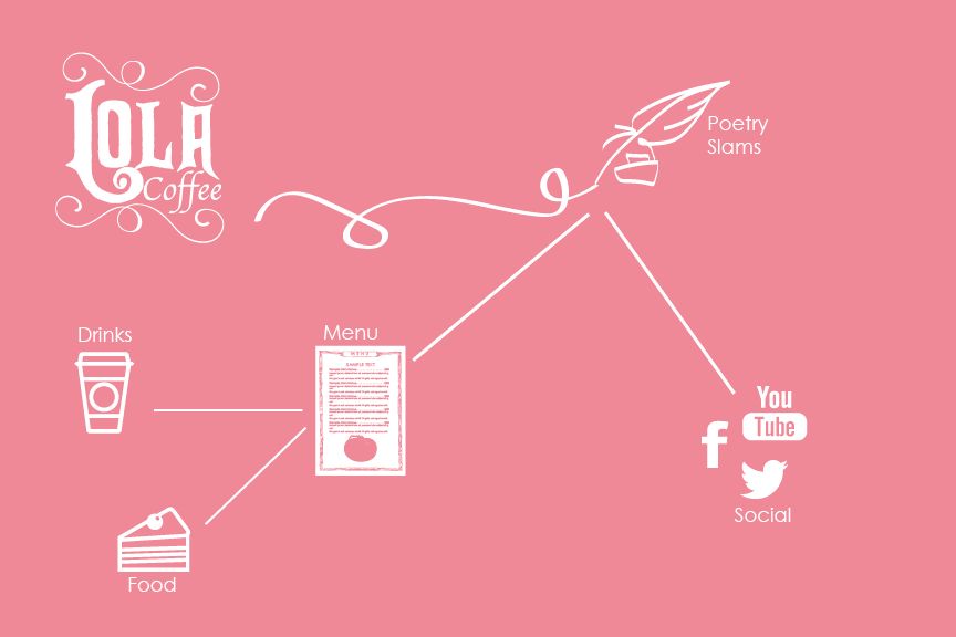
For the UI/UX, I had to focus on creating a mobile interface. That had to focus on the main features of the brand that I wanted to focus on.
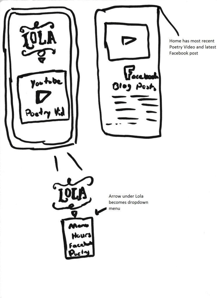
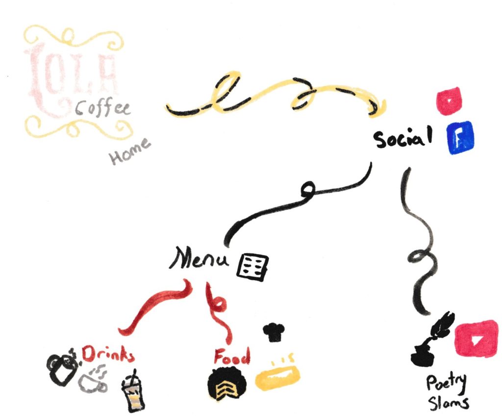
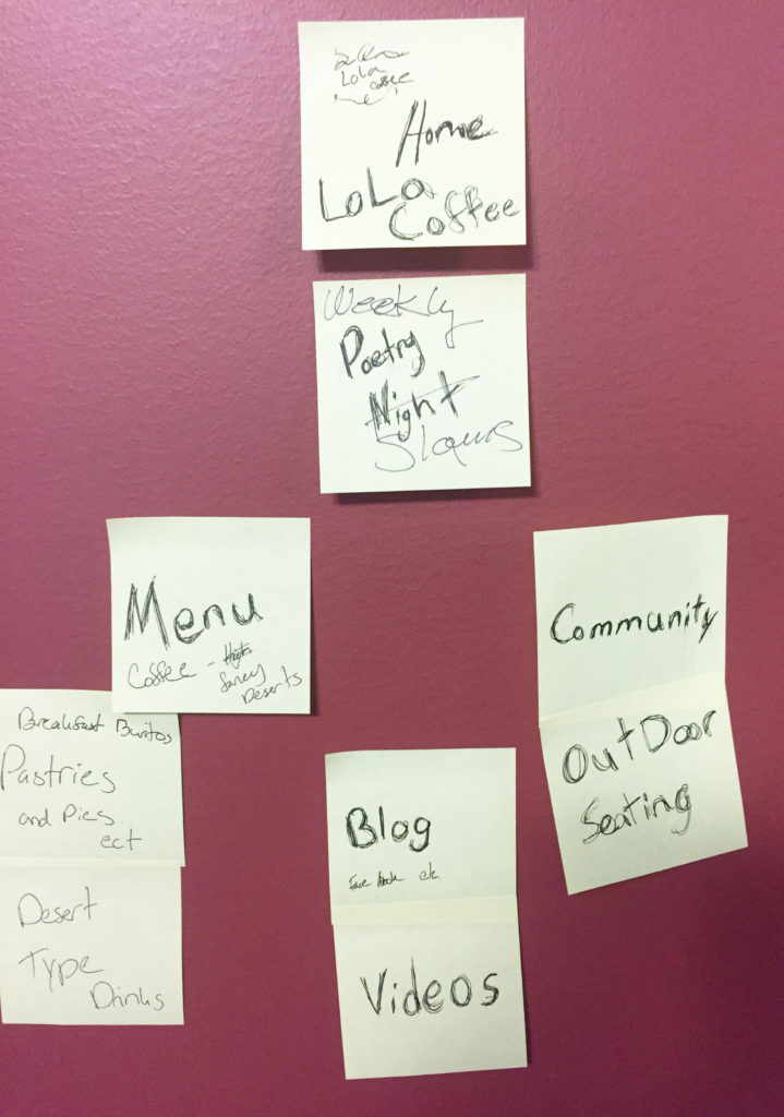
I wanted to primarily focus on the poetry for the selling point. I even made gamification that also focused on the poetry aspect of the coffee bar.


Style Guide

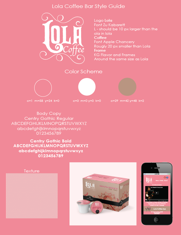
Last but not least, I developed a style guide to incorporate all the elements I used for the brand guidelines.
This was my entire re-branding process for Lola Coffee Bar. I came to not only know how to develop a brand but to justify my design choices for business.
